Person Listing
Creating Components
Custom Title


What is an Person Listing?
The Person Listing component allows you to place person profile cards on a page. The Person Listing can be displayed either vertically or horizontally.
How to add an Person Listing
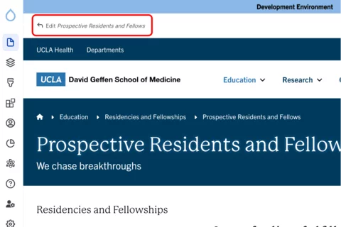
Click the edit link at the top of the page

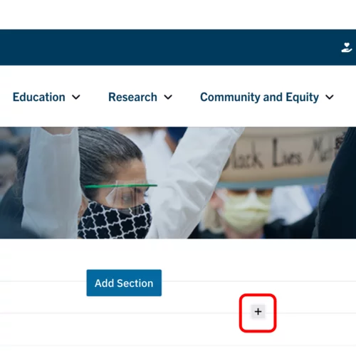
- Move your cursor where you want to place the component. (Add a section if needed).
Click the plus icon.

Select Person Listing from the menu

Content
Add the Title of the group you are creating.

Start typing the name of the person(s) you would like to add in the person field.

- Click the Add another item to add additional persons.
-

- You are able to reorder the person listing by clicking the all direction arrows.
Styles
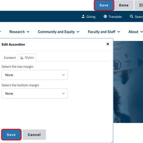
Toggle to the Styles tab.

Select the appropriate Display option based on your desired layout. (See below for examples).

- Select the amount of additional space you would like above the component.
Select the amount of additional space you would like below the component.
Note: By default, there is no space below a component.
Save
- Click Save.
Scroll to the top of the page and click Save.

Click the Done button beside the save button.
Note: This will display the page in the closest representation of how site visitors will view it. All links and actions that are disabled in editing mode will be functional now.

Style options
- Layout Options settings used to create this component are: Display as: Grid
Custom Title


- Layout Options settings used to create this component are: Display as: List
Custom Title


