Pages
Design Visually Appealing Content
Creating a Page
What is a Page
The Page content type is used for static content that can be (but not required to be) linked into the main navigation bar. This is one of the most used content types and can be very flexible.

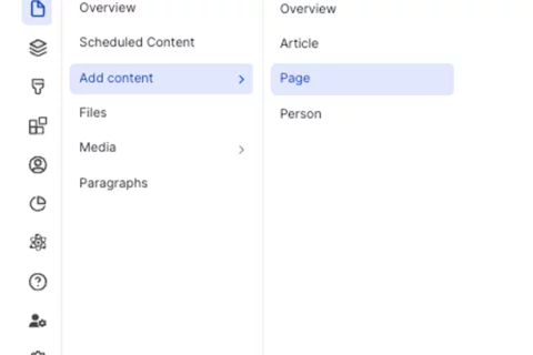
To create a Basic Page:
- Click Content on the second panel.
- Click Add content button.
Select Page from the list of content types.
Title [required] - The text entered in the title field will be included in the breadcrumbs and will become the page's URL unless otherwise configured.

Subtitle [recommended] Add a subtitle.

Select Who Will Review This submission? [required] For Sites with site access enabled Only

- Search Engine Optimization (SEO)
- Target Keyword: The search term or phrase people will Google to find this web page.
Meta Description: [required] The short summary displayed underneath the URL in Google’s search results.

- Select Search Listing Options [recommended] - Once you have made your selections, the categories will appear as part of the faceted search. This means that site visitors can easily filter to your content.
- Areas & Page Category: Used as a page search results.
Page Tag: Adds topics to your page.
To have additional taxonomy terms added, please contact your Site Administrator or fill out a Support Form.

- Add the desired component and learn more about the available options.
Click Save to publish the page.

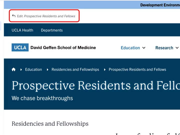
- Go to your page.
- Click the edit link at the top of the page.
-
Expand the Menu Settings in the Additional Options section.
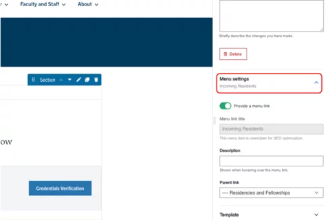
Toggle the Provide a menu link.

Select the Parent Link dropdown menu. If this is not selected, the page will appear on the top navigation.
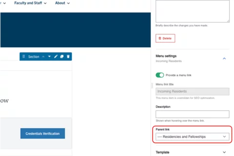
- Select the appropriate Parent page in the correct page structure location.
Scroll to the bottom of the page and click Save.
Content Layout
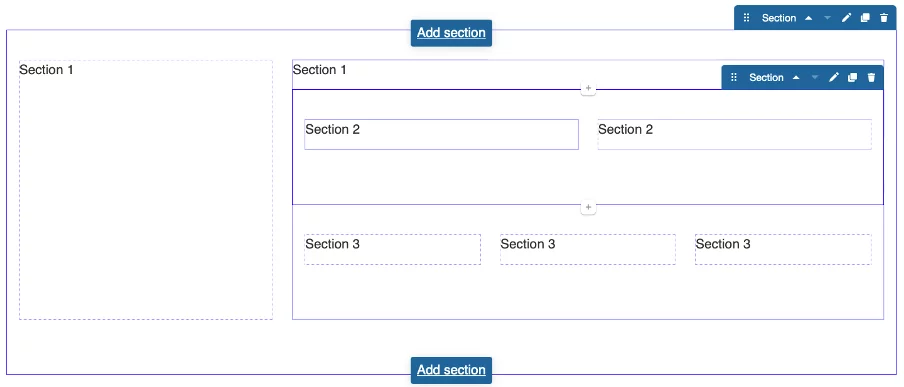
Within Pages (Layout Paragraphs) there are two types of containers to hold your content. You can think of this like tables in software such as Microsoft Word or Excel. First you need to define the number of columns in your row which Pages (Layout Paragraphs) refers to as Sections. You can have up to four columns in a row. Once you have defined the number columns you would like in a Section, you can add a component(s) to each of your columns. A component can hold various types of content, such as images or text. An easy way to think of a component is a unique container that holds a piece(s) of content.
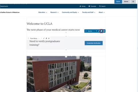
Section
A section is the primary way to layout your content in a visually appealing way. The section is the foundation on which all your components will be inserted. You can have as many components as you like on your page. Typically a one column section at the top of the page with breadcrumbs and the page title is used most commonly. The section below would then be two columns 30% and 70% and hold your main menu navigation in the left column.
What is a section?
Using sections is an effective way to enhance the visual appeal of your content. When creating or editing content in the web platform, a section refers to a group of fields that are logically grouped together. This grouping improves content editing usability by organizing related fields into manageable parts. Sections also help organize content visually; for example, a page might have a header section, a main content section, a sidebar section, and a footer section. These sections aid in structuring content and enhancing the user experience.
- Log in to your site.
Click the edit link at the top of the page
Click the Add Section button.

Select the layout with the appropriate number of columns.

Styles
Toggle to the Styles tab.
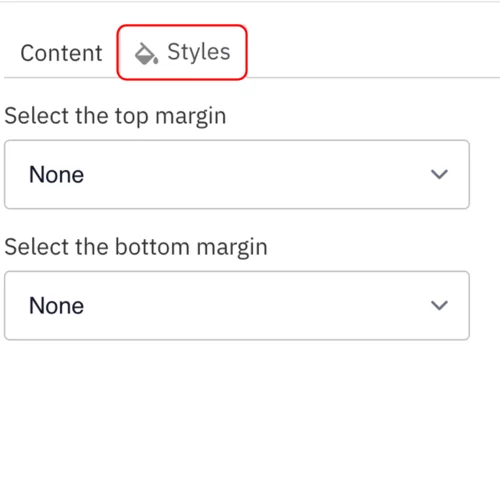
Select the desired background color to highlight components: None (default), Santa Barbara Sand, or Venice Canal.
Note: Applies only to One Column Sections.
Note: This setting is only available for site administrators and should be used sparingly. It is recommended to apply it only once per page to emphasize key information.
Select Columns to place your section horizontally. This should be used only with the Icon component.
Note: Applies only to One Column Sections.
- Select the amount of additional space you would like above the component.
Select the amount of additional space you would like below the component.
Note: By default, there is no space below a component.

Save
- Scroll to the top of the page and click Save.
Note: You must click save after you add each section – this step is critical.
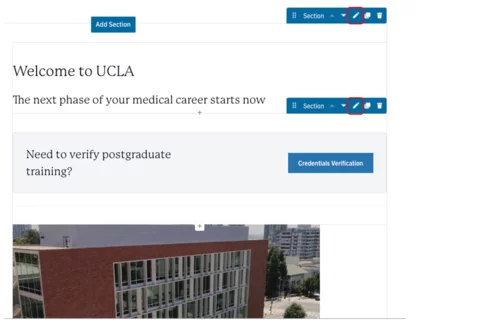
Click Edit content at the top of the page.
- Hover your mouse over the section you would like to move.
- You will see the section menu appear on the right side, click on the 6 dots.
-
- Drag the section to the new location.
- Scroll to the top of the page and click Save.
-

Click Edit content at the top of the page.
- Hover your mouse over the section.
You will see the section menu appear on the right side, click the Pencil icon.
Select the desired Column layout.
- Depending on your selection, you may be presented with Move Orphaned Items. You are able to select where you want to place the existing content.
Scroll to the bottom of the page and click Save.
Copying a Section
- When you copy a section, all the content is copied as well.
Click Edit content at the top of the page.
- Hover your mouse over the section.
Click the duplicate button.

- Your copied section will appear below the current section.
Scroll to the top of the page and click Save.
Deleting a Section
- Click Edit content at the top of the page.
-
- Hover your mouse over the section.
Click on the trash can icon.

- Confirm you want to delete the section.
Scroll to the top of the page and click Save.
Note: The ability to add background color can only be applied to a one column section. This feature is also restricted to those with Site Administrator access.
To utilize this feature on your page:
- Log in to your site.
Click the edit link at the top of the page
Click the Add Section button.
Select the layout with the appropriate number of columns.
Styles
Toggle to the Styles tab.
Select the desired background color to highlight components: None (default), Santa Barbara Sand, or Venice Canal.
Note: Applies only to One Column Sections.
Note: This setting is only available for site owners and should be used sparingly. It is recommended to apply it only once per page to emphasize key information.
Save
Scroll to the top of the page and click Save.
- Select "Add Section"
- Select "One Column" under "Choose a Layout"
- Expand "Layout Options"
- Expand "Layout"
- Select the background color. (None, Santa Barbara Sand or Venice Canal)
Note: default background color of a One Column section is None. - Click Save
Now you will have a background color behind whatever component you place in this section. When using the Santa Barbara Sand background color text will appear white. When using the Venice Canal background color, the text will appear black.
Components
You can use many types of components to customize your content. The instructions on how to create a component provide an example of what each component looks like, followed by details about how to create and format a components. While UCLA Health has many different themes or looks to its sites, the instructions below are the same regardless of the theme used on your site. Branding and formatting will be updated based on the theme in which you create the content.
Once you have created your components, you can easily drag and move them to the new location. It is simple to copy and delete components in Pages Learn more about how to use these features see bottom of the page.
See the full list of Components
Managing Components That Are Already Created
Click Edit content at the top of the page.
- Hover your mouse over the component you would like to move.
You will see the component menu appear on the right side, click on the 6 dots.

- Drag the component to the new location.
Scroll to the bottom of the page and click Save.
Copying a Component
Click Edit content at the top of the page.
- Hover your mouse over the component.
Click the duplicate button.
- Your copied component will appear below the current component.
Scroll to the top of the page and click Save
Deleting a Component
- Click Edit content at the top of the page.
-
- Hover your mouse over the component.
Click on the trash can icon.

- Confirm you want to delete the component.
- Scroll to the top of the page and click Save.
If you would like to reuse a component on multiple pages, the instructions below review the steps. For users who previously used Layout Builder, this was called a Custom Reusable Block.
Creating a Reusable Component
-
Hover your mouse over Content.
-
Click Paragraphs.
-
Click the + Add library item
-
Add the Name of your reusable component.
Note: This is the name you will need each time you want to place the block. -
Select the component that you want to use from the dropdown menu.
-
Complete the necessary fields for your component.
-
Scroll to the bottom of the page and click Save.
Placing a Reusable Component
-
Go to the page where you want to place the component.
-
Click Edit content.
-
Click the plus icon where you want to place the component.
-
Select From Library, from the menu.
-
Start typing the name that you gave to the content you created and select the applicable Reusable component.

-
Click Save.
-
Scroll to the bottom of the page and click Save.